Hey guys, this post kicks off the first (of many) developer diaries that you will find on the site regarding Strike Wing development as well as other things linked to generic game development.
Text and fonts? Why would we care about this ?
There are a few reasons why any developer should focus on text rendering and fonts as early as possible within the game development cycle. Let’s see what those reasons are:
1) Interface scale – as long as you plan on having information displayed in the form of letters or numbers, your interface scale will be directly dependent on your font shape and size. You want to start designing all your text related elements taking into account the largest possible values, just so that you’re not surprised when that crazy hardcore gamer hits the maximum score possible, for example, or when somebody decides WWWWWWWW is his screen name (yes, W is the generally widest letter in almost all fonts)
2) Ease of reading – You want an easy to read font that is as small as possible but still do the job. The human brain is very good at recognizing shapes, however take into account that games are dynamic. The eye is very easily fooled by moving patterns, reflections and other things. That and also some gamers have a certain degree of dichromacy (the disease that doesn’t allow people to see colors properly). Last but not least, especially for mobile games you must take into account the small screen (with a questionable panel) that is always moving, so your text will be much harder to read than let’s say on a monitor.
3) Managing expectations – iOS development in particular will pit you against products with pretty high standards for typography. Almost all top games and apps make use of beautifully rendered fonts and the user will automatically think “blurry fonts = inferior product” . And we all know that “inferior product = no money“. Have you ever started up a game and said “wow, this is awesome” straight up from the menu? If not, I give you 2 examples: Civilization 4 with its sharp menu and Grammy winning Baba Yetu and Colin McRae’s Dirt menu.
Basically the first thing that the user sees is your text, be it the menu, in a logo, or anything else.
So having cleared that up, there are 2 big ways in which you can integrate fonts in your game
- Truetype fonts – vector fonts will always render beautifully, however you will not be able to easily add effects to them unless you do some form of postprocessing. Also, truetype implementation takes time and rendering is kinda slow.
- Bitmap fonts – most games use these, because they are very fast to implement and render, you can apply various effects on them extremely easy and they are generally easy to create. HOWEVER they don’t scale well at all.
We have chosen to go for bitmap fonts for Strike Wing and our engine in general because they fit our needs as well as our tight development schedule. So here’s what we did:
- We are using 2 font sets and interface modules for the two main resolution groups of iOS devices (iPhones have a 480×320 or upscaled resolution, while the iPads have 1024×768 and upscaled).
- We have identified 3 font sizes that we are going to use throughout the game. One for small text and HUD, one for subtitles and buttons, and one for big titles. This allows us to make fonts that will be rendered pixel perfect every time. If we would have gone with font scaling, you would get a smudging effect somewhere
- Pixel shadow – you need at least a 1 pixel dark shadow for your letters in order for them to be readable against both dark and light backgrounds. The 1 pixel shadow creates a perfect contrast that allows you to read things much easier.
- We have identified the font requirement checklist – this is crucial, because it allows us to get some good quality without wading through billions of existing fonts. The two main requirements for the fonts are
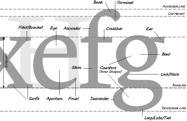
- Sans Serif fonts – these fonts lack extra tails and swishes and what not. You cannot afford serifs and ornaments in fonts for small devices, as a general rule, because there is only so much that you can do in 10 pixels
- Square characters – this is another big thing. If you can encase the letters o,e,c,w easily within a square form you will have a font that is evenly spaced, relaxed and easy to read.
- All caps fonts – caps allow you to have a certain consistency across your text, plus they are much more space efficient than non-capital letters. This and they don’t give you headaches with letters that are below the base line, such as q,g,y,p. Good luck aligning those properly with the rest of the interface.
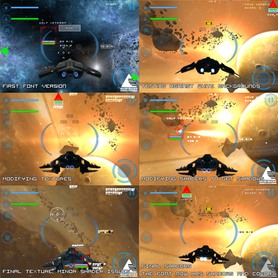
So in closing, I’m going to post a small animation of the stages that the smallest font that we use (for the iPhone HUD). You can very well see the stages that go from a simple font to a pixel shadowed sans serif and effect using font 🙂 Please ignore the rest of the interface as it is subject to a total makeover.

Cheers!
